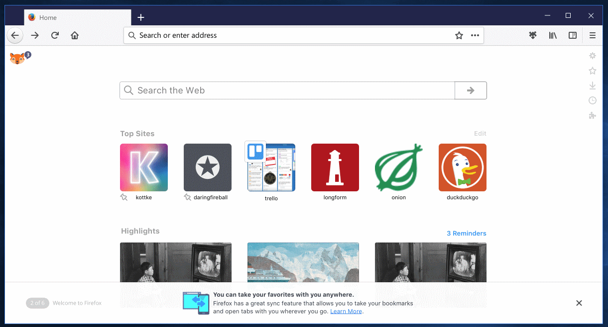
In the autumn will give Mozilla Firefox browser version 57. At the same time debut a revamped user interface called Photon.

About tom, what Firefox must undergo a visual change or quite simply lifting, we have heard not once, not twice, but until now we did not know, каковы будут конкретные последствия – до вчерашнего дня, until GHacks not the first screenshots appeared, depicting the new browser interface called Photon.
Firefox 57 (to be presented in autumn) will have a new interface, much more minimalistic. Something he would remind the Opera and Vivaldi, but also with a hint of originality. Производителем браузер Photon задумывался как простой и легкий в использовании, but would in fact tell the users themselves in a review, after the.
Характерной чертой нового интерфейса является расположение адресной строки – по центру. The culmination is the ellipsis icon, which opens the sharing menu and quick access to useful functions.
Also in Firefox 57 you can select one of several topics. In addition, Mozilla is committed to supporting the implementation of several processes and the transition to the expansion WebExtensions. For design thanks to these changes the program must fight off their positions, she loses a few consecutive quarters due to fierce competition.